There comes a time in the life cycle of a business when you look at your website and feel a sinking feeling in your stomach. It could be shame. Perhaps it’s anxiety. Or maybe it’s a touch of embarrassment.
Somewhere along the way, your success surpassed your website and you have no idea when it happened. For the longest time, you knew your site wasn’t great but you were too busy selling, marketing, creating, and delivering to worry about it.
You became successful in spite of your website, chasing down leads and converting them.
But now leads are chasing you down, Googling your name, and landing on a website you’ve neglected up until this point because you had to.
You realize your website no longer represent the value you offer or the Influencer you’ve become. And it is costing you leads, money, and opportunities.
Now that you’ve cemented yourself as an Influencer in your space, it’s time to give your website the attention you – and it – deserves.
It’s time to bring your website up to your level so that it fully represents who you’ve become and what you provide.
To do that completely would require a complete rebrand and rebuild from the ground up, building your site from scratch on the foundation of your essence, authentic expression, and influence – with your 3 to 5 year goals and vision in mind.
But, in the meantime, here are 3 things you can do right now so that your site stops leaking money and starts converting move visitors into revenue.
Tip #1: Include a “Power Statement” above the fold of your Homepage.
Studies show that when someone lands on your site, you have 5 seconds capture their attention. So, the space on your homepage that is “above the fold” (the area readers see without needing to scroll) is the most prime real estate on your website.
It is where you
- Establish relevancy
- Give a clear indication of who you're serving
- Give a clear indication of your unique value.
A power statement does all of these things, helping your ideal prospects realize how much you understand their situation and how you are the exact person they need.
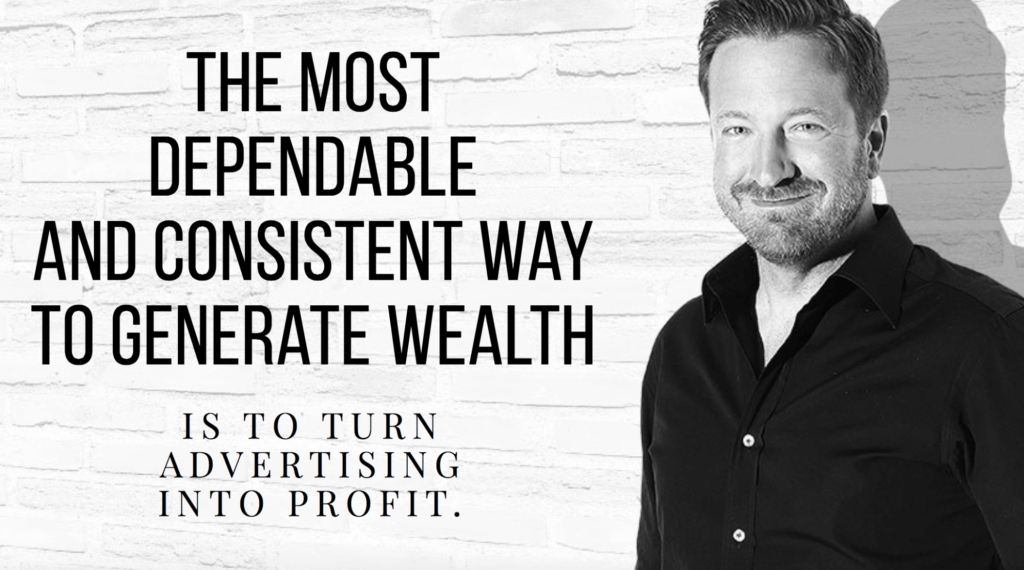
For example, here’s what we created for Frank Kern:
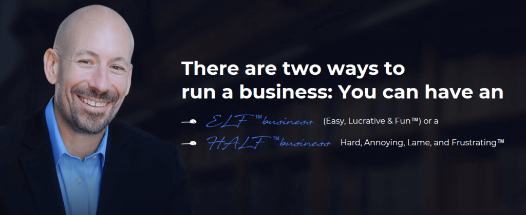
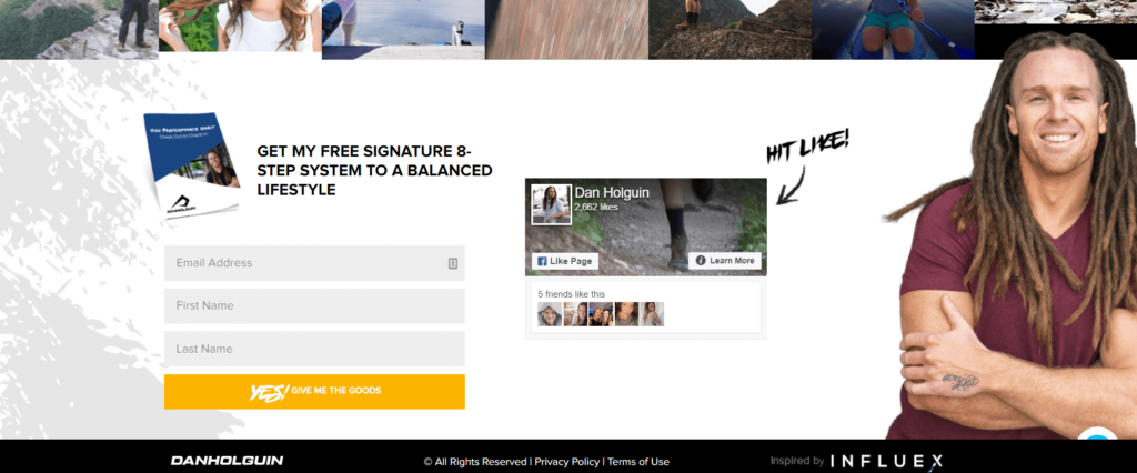
Here’s one we did for Dan Holguin:

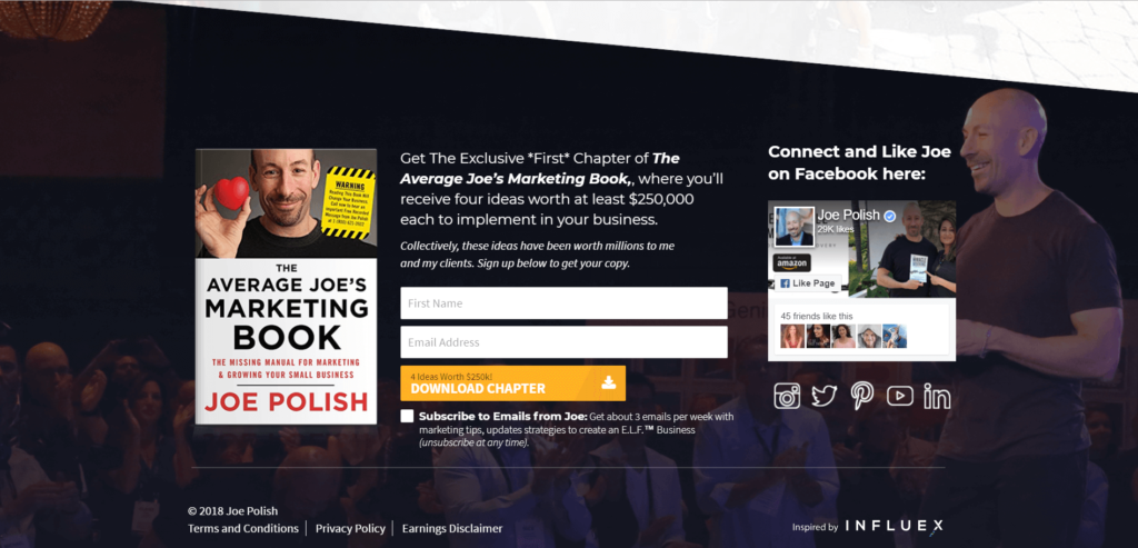
And here’s what we did for Joe Polish:
Tip #2: Under the Power Statement, have one clear “Call To Action” and “Opt-In Gift” (also above the fold)
Give your prospects the support they need most … and give it to them for free right at the top of the homepage in the form of a free Opt-in Gift.
The free opt-in gift should help them take the first step towards their transformation and towards working with you. To offer this to them, you’ll need:
- A polished product image to represent the free gift.
- A smaller headline and sub-headline for the opt-in itself.
- An opt-in form that will capture their name and email address, converting them from a visitor to a lead. The free gift should then be delivered via email.
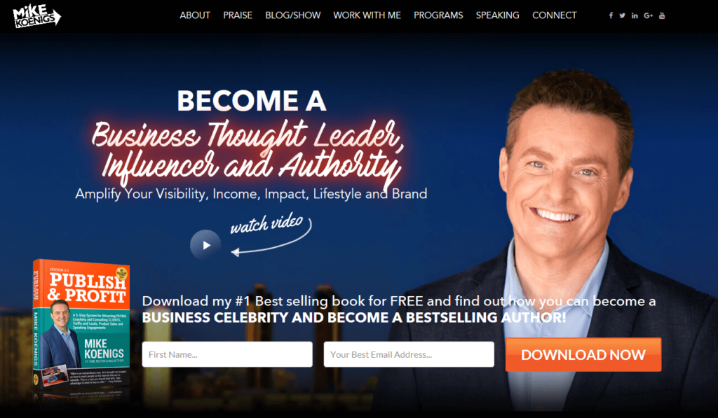
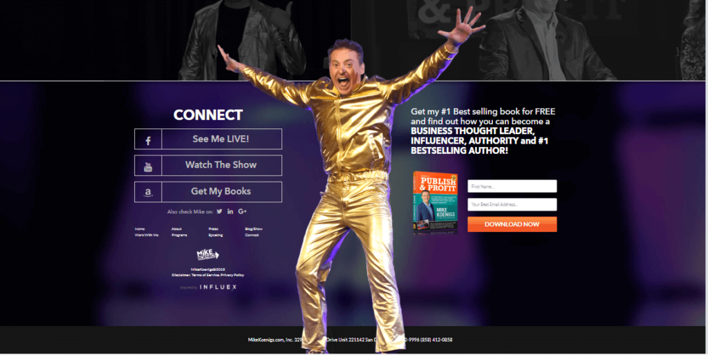
Here’s what we created for Mike Koenigs:
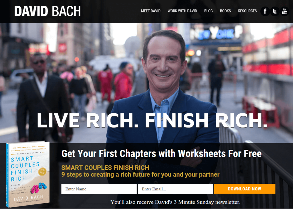
And here’s what we did for David Bach:
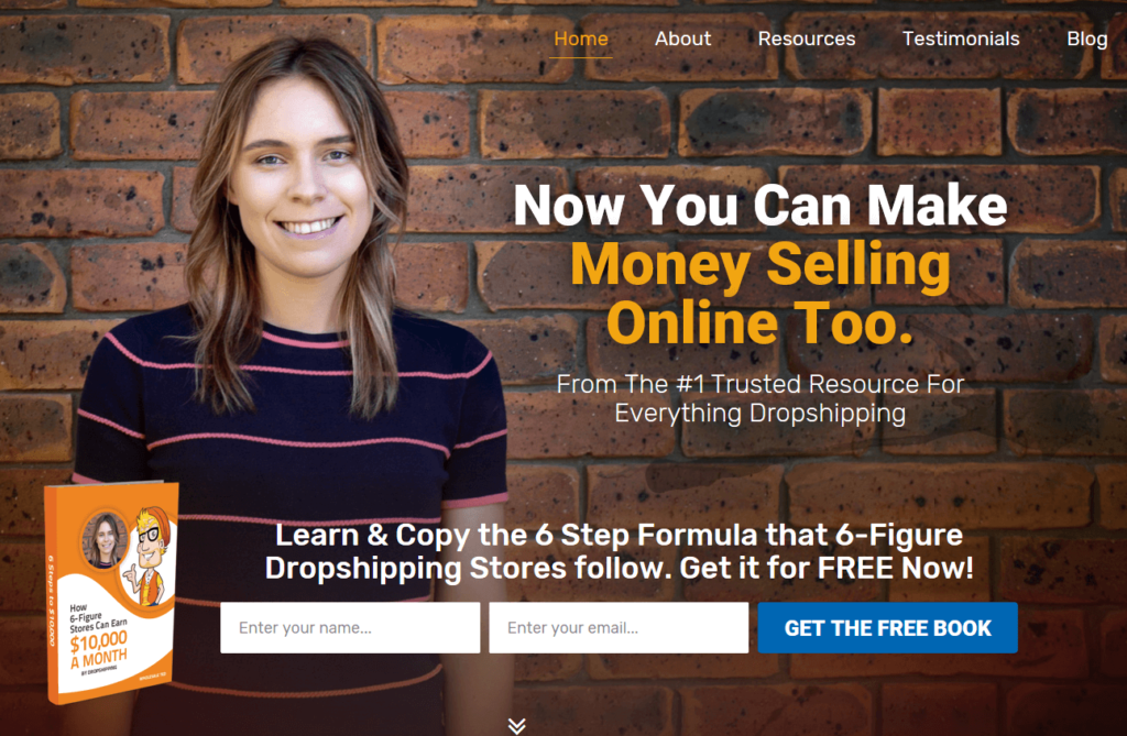
And for Wholesale Ted:
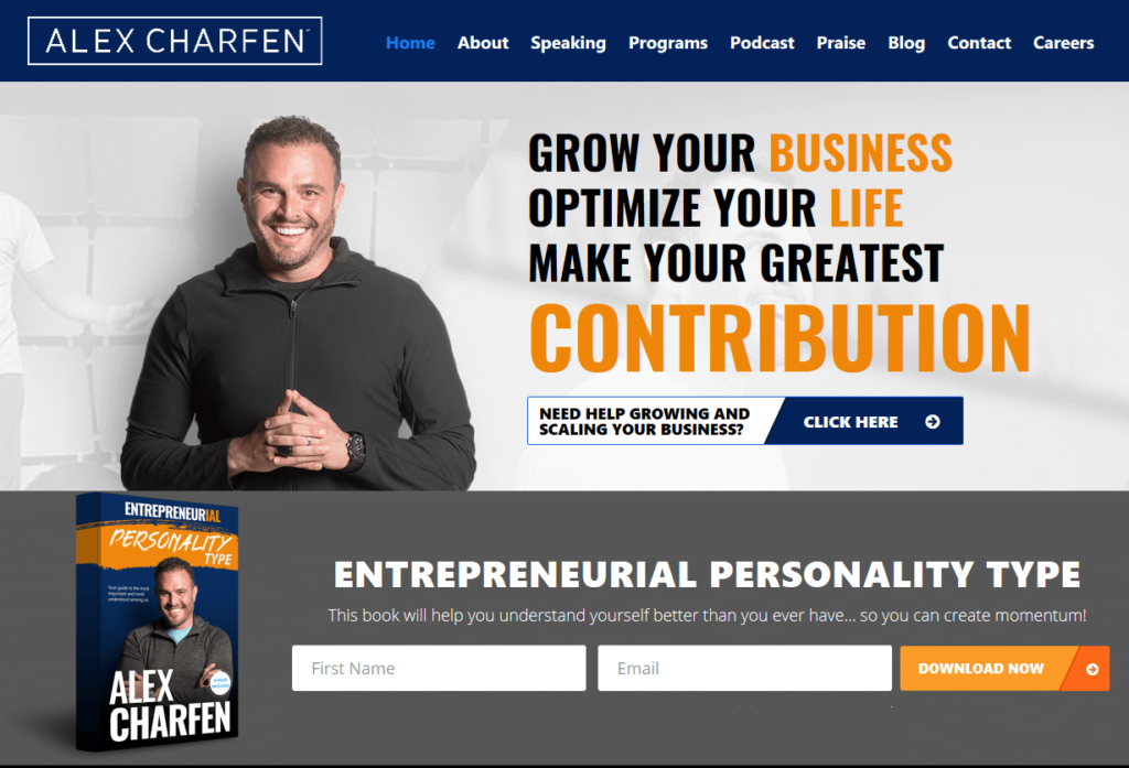
For Alex Charfen:
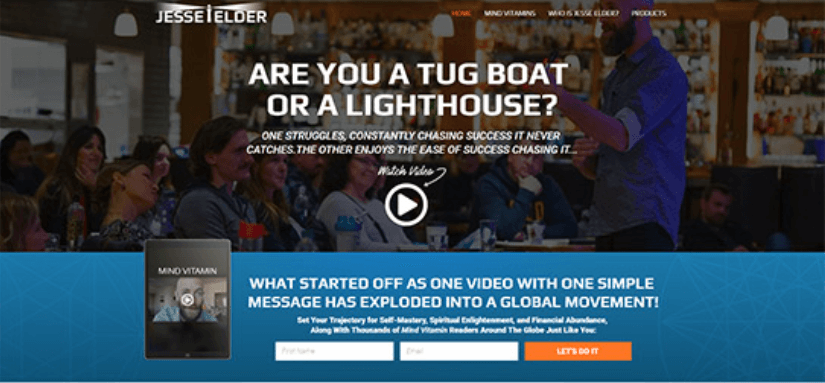
For Jesse Elder
You can follow the examples on those pages. Or here are some templates you can plug into:
- “This _______________ cheat sheet will help you _______________, get immediate ______________, and __________________ , daily. Where should I send it?
- “This _______________ checklist will help you _______________, ___________________, and __________________ in the next 30 days.. Where should I send it?
- “This _______________ guide will help you immediately _______________, ___________________, and __________________ . Where should I send it?
Button Copy Example: Get your FREE Checklist/Guide/Cheat Sheet/Chapter Now.
Tip #3: Upgrade Your Navigation To Be Simple and Client-Centered
Instead of naming your pages things like “Author”, “Speaker”, and “Advisor”, which describe what you do, name your pages so they describe what your prospects can do with you, like “Work With Me” or “Book Me to Speak”.
Keep your navigation down to between 5 and 7 pages. Keep sub-menus to a minimum where possible. Combine and Delete any pages that aren’t absolutely necessary.
Keeping your navigation simple and client-centered reduces confusion and helps guide your prospects to a clear Call To Action (the first step to working with you). This is key to conversions. A confused mind takes no action.
Here are the most common pages used in a successful Influencer site (The top 7 should be chosen for the main navigation):
- About / Our Story / Meet _____
- Work With Me / Programs
- Press & Media (if available)
- Testimonials / Praise
- Podcast / Blog
- Book Me to Speak / Speaking
- Resources
- Contact
Finally, in the top right corner of the navigation menu, include a call-to-action button. Here’s an example:
For the FitFatherProject, we included a Call To Action to their 30-Day program in the top right corner. It is one of their entry-level and most popular programs and it’s a great way for clients to get introduced to working with them.
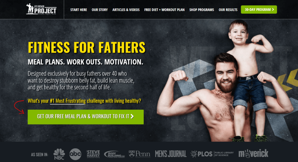
So this opt-in is always visible no matter where the prospect scrolls on the page, make the navigation “sticky” so it stays at the top of the screen even if the user scrolls. You can see this in action if you scroll down the homepage of FitFatherProject.com
Bonus Tip #4: Create a Strategic Footer.
Most websites include only a few things in the footer: The Copyright, Terms and Conditions, and navigation links. It’s usually an afterthought.
But think about the Footer as the fancy shoes of your site. Shoes always make an impression. Your suit or dress (your website) could be the most stunning outfit you own and it could be completely ruined by old/unattractive shoes (most site footers).
Many prospects skim through your site and, out of habit, scroll all the way through to the bottom of your site. And, most of the time, there’s nothing there of interest.
Surprise your prospects with an engaging useful footer that helps guide them to the tools they need most, namely the …
- Same Free Opt-In Gift you created as part of Tip #2 (a way to get started with you)
- Ways to connect with you on Social Media
- Testimonials that provide social proof. (Bonus tip 4b: sprinkle testimonials throughout your homepage for even more social proof and conversions!)
Here are some examples of ways you could create your strategic footer:
Here’s the footer we created for Mike Koenigs:
… and for Joe Polish:
And for Dan Holguin…
You’ll notice how we included Social Media elements, introducing another way for people to engage with you. But most importantly, the footer strategy is to provide a beautiful “call to action” for prospects to download a free gift and start their journey with you.
There you have it… the top 3 simple shifts for your site to stop leaking money (plus a bonus one)! Now, all there is to do is implement them. And…
If you’re interested in giving your site a further upgrade, check out our Custom Website Review service.
- We’ll look over your website from top to bottom and provide specific recommendations that can mean big improvements in getting conversions, sales, and leads.
- We’re only doing this for a limited number of Influencers in order to gather some data as we build our website review tool. We hope your site is one of the ones we get to review!